Things have been busy and challenging this past week and a half. The weekend before last I went home on Friday to stay until Tuesday but when Monday night came I couldn't bear the thought of leaving yet. Thankfully we bought the tickets with frequent flyer miles and we were able to change the ticket for free and stay for one more day! For whatever reason that one day made a big difference and I was ready to return for the last stretch by Wednesday. I came back and jumped right in. With a little less than a month to go (minus the few days I will need to pack up all of my stuff) I was feeling a little panicked! So as I do each semester for school and as I encourage my advanced students to do I made a firing schedule in reverse order from the last firing I had to do which I scheduled for the 24th and then went backward to the beginning of the month...and so far so good, I am on schedule.
But since this is a reverse kind of blog I am going to show you my progress in reverse...
These first images are the grasshoppers I have made so far. Today was my last day to cast and I will have approximately 7 sculptures to work with. I have decided not to make the twig sculptures here as I think they will be virtually impossible to pick up and at home I will build them on my kiln shelves (I actually may make one just because I have the pieces cast...but no more than that). I was originally planning on making 10 of each piece but as the reality of bringing all of this work home (including all of the molds)dawned on me I decided to scale back a bit...
Grasshoppers
 Multiplying...
 They are like rabbits!...More and more of them!
 At first I wasn't sure I liked the grasshoppers...they seemed silly but as I made more and more of them they became both funny and kind of gross...kind of like owning one or two cats is cool but owning 100 cats is creepy. I plan on glazing them with colorful but crusty glazes, I think it will help them become more awkward and uncomfortable looking...kind of gross and all over the place...and that is the goal. In Arkansas (in my opinion) summer is about hot, sticky grossness, it is uncomfortable, sweaty and inescapable...so I am trying to make these pieces have a similiar feel of overwhelming discomfort.
Below are details of what I like from the glaze firing of the snowballs and the birds. I was not happy about the results that came out of the kiln overall but there are areas of hope and excitment on many of the pieces. Forunately the exhibition I will be in here at NCC won't be until next May so I have time to really get these right...which is important as I will be showing with some other people whose work I really like and honestly feel like they are way out of my league...Carrie Esser who teaches at the Kansas City Art Institute and Ursula Hargens whose work I love and Maren Kloppman who everyone knows, beautiful work...yikes! you could look up the work of all of these women online if you are interested in seeing what they make. It is a lot of pressure! I should add that many folks here commented that they liked the work, which I appreciate, however they do not fit my vision of the project so I see them as unacceptable even if thet don't seem it to others.
This is an example of one of the things that caused my disappoinment and something I like all in one. This yellow glaze was actually a chartreuse mason stain...it is NOT chartreuse, and I used it a lot so instead of lush greens with areas of yellow and orange I got a lot of yellow....not spring lie at all. However, I do like the combination of yellow slip under this yellow glaze and may use it in smaller areas or in the summer pieces.
 Below on this one you can see the other major disappointment in combination with what I actually wanted. On the left of the piece the overall color looks anemic, thin and too white. On the right side especially the little bird the green is applied over another green slip and is much richer...it is far more vibrant in real life than what it looks like in this image. It is interesting because these are all glazes I use on my pots and have only occasionally thought they looked thin and overly white but on these larger pieces it seems to be emphasized 100 fold!
You need to look closely at the next two images as they are white on white slip and glaze application. I really like them, they are subtle and pretty beautiful in real life but I think the glaze needs to be a little less shiny, a bit softer looking, like a satin matte clear for it to really work like I see in my minds eye.
 This image looks a little grey but it is actually bright white.
 I love this detail...here I drew a pattern on the piece with a blue underglaze pencil and filled it in with an icy copper blue glaze then covered with a clear glaze...and the side of the balls where the glaze ran it brought the pencil down with it and on the top it stayed pretty sharp. I really like the variation.
 This is one of the more heavily pierced pieces which I like quiet a bit...it brings a lightness to the form which I think could be effective in future pieces and in the overall composition of the large panels.
 Here is a picture of me thinking about how these might look together...that will be a whole other big problem to solve!!!!!!!! I imagine at least ten pieces per panel that are all different but also have unifying elements...
 Here are the some of the birds that I feel okay about...again the overall yellow coloring is absolutely not what I wanted...but once that problem is solved I think I will like them all hung in a group. These pieces seem to combine en masse more easily and successfully than the snowballs. I'm pretty sure it has to do with their outward push (visually the wings acting as directional lines away from themselves and towards other pieces where the snowballs are more internally (closed forms) directed, they close in on themselves rather than direct ourtwards. This happily works with the sense of the seasons that I am trying to capture but nonetheless will make for a challenging layout.
 Below you can see why it will be important to have a darker background. Above the pieces pop forward more but below on the lighter background they disappear a bit. UGH see all that white and light colored glaze...FRUSTRATING!
 Here are a bunch of the snowballs...ditto on the darker background
 Here you can see the last two shots which are of the pieces glazed but pre-fired. It is hard to tell but each piece is 12 inches big and bigger, they look very small in these overhead shots. Those round black discs are 13" bats that we usually use when throwing on the wheel.
 So there you have it. I have been pretty disappointed since I unloaded the work this past Tuesday but I am pushing through and trying to get over it (the piece of chocolate cake I ate today acted as pretty good solace which was what I was hoping for). As we speak I am cooling a kiln full of these same pieces that I have fired lower to cone 05. I wanted the backs of the pieces to be glazed too so I flipped them over glazed the backs with a lower temperature glaze and am firing them upside down. I am hoping that the firing doesn't do anything to the glazes (make them craze(crackle) ) or to the pieces (it is possible but unlikely that they could slump).
So tomorrow I put together the last of the grasshoppers, unload the 05 firing and start decaling, china painting and lustering to my hearts content. I plan to load the grasshoppers for bisque Saturday or Sunday.
In other news the Northern Clay Center is having its annual American Pottery Festival which is their major fundraiser of the year. There is a HUGE selection of work to be sold in the gallery by some really great potters...I want to say there is something like 70 potters represented in total and I have gotten a preview of the wares...if only I were a millionare I could buy all of the pieces I like. There will also be workshops, lecture and parties to be attended. Walter Ostrom is speaking on Sunday which will be a treat to see, and there will be a party Saturday night with artists and collectors which should be fun!
A few weeks later Patti Warashina will be here to present a lecture at the MIA and she and Ron Meyers will have a formal conversation about a lifetime in clay the next day at NCC. That should be interesting as they have both had very long and distinguished careers in ceramics but their work is very different.
To all of my ceramics students...Minneapolis is an outstanding place to be if you are interested in ceramics. (Actually they recently became one of very few, if there are any other, states that has arts funding written into their constituion!!!! so really it is a great place for all artists to be). I had always heard this to be the case but being here and experiencing a bit of it has proved it to be true beyond what I could have imagined! You should all apply for a Jerome or Fogelberg fellowship here at the NCC and try to get in on this action! Or just move here ...you can't take a step without your foot landing in a clay opportunity!
Until next time...

 I am trying to stick to a strict schedule because I am leaving to go home on Friday until Tuesday and then really I only have three and a half more weeks to complete the work!. I needed to get those pieces bisqued and to start casting the other two seasons (Fall and Summer...twigs and grasshoppers)...the first of which I caste this Tuesday. I kept casting through Thursday but didn't get a lot done as I was having some problems with the molds, I was only able to put one piece together by tonight! However I got through my casting problem thanks to my friend Derek (he and Jeannie are my mold making lifeline) and a young guy here named Swen who knows some about slipcasting. So I have a bunch of parts stored until Tuesday when I return...I figure I only have that first week of September to caste fall and summer...then it will be all firing, glazing and decaling until the week before the end of the month! I can't believe how quickly it has gone by in terms of the work...yet it seems so long in terms of being away from home. So as always seems to be the case with ceramics no matter how consistently you work the #@!* always hits the fan at the end. So when I return I will be casting pieces, putting them together, glazing pieces (three more times once at cone 6, once at cone04 and again at cone 019), decaling and lustering, bisquing the hoppers and twings and all of the above firing again...gulp!
 Here is the casting problem...The sunken in part of the legs is where suction was created becasue of poor venting. It is similar to trying to pour ketchup out of a full bottle, sometimes no matter how hard you shake the bottle it won't come out until you stick a knife up in there to create an air vent. You can't shake the mold like that or the piece would collapse, but the suction causes the still wet and thin skin of clay on the inside of the mold to pull in and collapse. Sometimes it would do this and no slip would pour out so the piece was solid (which is not what I want) or it would pour out and still collapse. So I had to drill some vent holes in the molds and make some of the pour gates bigger and it seems to have solved most of my problems!
 Below is the resulting first piece...to be honest I'm not sure how I feel about it...it's pretty funny looking which might be okay. I am trying to not judge it all too much right now...I need to finish a few, get them glazed and then see what I think.
 At the begining of the week I spent all of Tuesday and Wednesday working on the computer to try to get enough of a handle on Photoshop to generate some decals that I could send off. Anyone who knows anything about Photoshop would laugh to see the decals I made and to hear how long ot took me to make them...but I am getting there and feel like it is a big accomplishment to have gotten just this far. Luckily for me a nice woman named Natasha Poppe who teaches graphic design around here agreed to come over and give me a few pointers so I was able to finish some decals and sent them off to In Plain Sight...the decal making company which, it just so happens, is right here in Minneapolis! I was fortunate to have sent them when I did because they were running a big set of decals and put mine in with them so they were ready the next day! I went to pick them up and Brian Bolden...one of the two owners gave me a tour of their set up. It was pretty awesome, they were in the process of making a tile piece that must have been over 100 feet long and 20-30 feet tall. Each 12x12 tile had a section of a large photo from an image taken from the window of a moving car. The photo was broken up into these 12x12 sections and would be hung to create the full image. They also made their own artwork using the decal process. It looked easy, an old copier retrofitted with ceramic colorants printed out decals which were then coated with a layer of flux and run through a heat sealer (like a laminator). Then the decal is soaked, slid onto the tile and fired at a specific rate in a computer programmed kiln. The fact that it looked so easy is a testament to how finely tuned they have their operation. Anyway that was fun to see.
 I always believe in facing the worst first...like ripping off a bandaid or giving an oral presentation...just get it done and out of the way, so here is the ugliest! I took notes on my slipping and glazing...that green was NOT supposed to be that color! It is the result of an unfortunate reaction between the slip and the glaze. YIKES!
 While not perfect this one is closer to my goal for spring, overall it is too light and the pink slip on the bottom is not pink enough (it looks totally white in this image)
 Detail of the part I like most
  Here is my least favorite snowball set. I don't like the grid at all, but I do like the glaze combo on the bottom right just maybe not in that large of a section or broken up with decals.
 If you can see it themotteled section on the right is what I like, nice variation in the glaze but too much on this large of a section
  I like this one quite a bit. The slip pattern was outlined (with GA28 for my ceramics II students then glazed with LET clear and copper over the top) and made the slip trailing less rigid/sharp edged which I like.
  Detail...you can see how tight the slip remains on the dots to the left and how much runnier it looks on the curvilinear pattern on the right.


 Very happy with this ...closer to my minds vision
 Detail of bee pattern
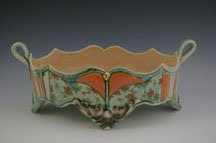
 Non studio news is that I bought a wonderful Warren McKenzie piece, he is a well known potter who has worked with Bernard Leach, taught at the University of Minnesota, and was the professor of many great potters of out time. He has left a big mark on the clay community, the Arkansas Arts center just had a big retrospective of his work come through if any of you saw it. His work is crazy collectable everywhere but especially up here in Minnesota. He has a belief that work should be affordable for all people, and so he prices it VERY low...the result was that people would come to his pottery sales at his home buy the ENTIRE kiln and then re sell it all for a much higher price. Because of that there are all sorts of rules, like you can only buy one piece a month, you have to be present to purchase the work and so on and so forth. Now the Northern Clay Center is the only place in Minnesota where you can but his pieces. I just happened to be in the office in back when his work was brought in and got to chose the first piece from the lot. It is a beautiful lidded jar a really nice example of his work and one that I will be happy to bring to school and show students...of course I paid literally ten times the price he had put on the piece but I feel it is worth it and Bill agreed. The ten times money goes to help support the clay center so it seems doubly worth it. Here it is...like most pots you need to experience it in real life to truly appreciate it, but it is a really nice one!


 Detail of the big set...the hot pink line is sharpie marker, it will burn out in the firing, I thought I wanted to put something there but decided against it.


 So I have four objects put together from my good clay and two from the test clay, now the really hard part begins. How to start applying pattern and decoration to these complicated and undulating forms? I started trying to carve a pattern on a test form on Thursday evening...it was a disaster, the "snowball" forms are the simplest of all of my planned sculptures and I couldn't get a straight line when I went over one sphere to the next. Then I borrowed a tip from Kip O'Krongly, the woman here whose work I admire, she uses thin plastic tablecloth to use as cut stencils, they are softer than the paper stencils I use and therefore bend more easily over a curved surface however it still wasn't what I needed, they didn't seem to stick enough to the form to create a clean line. I went home that evening discouraged and sure I would never be able to complete this project with any success. The next day I went to the studio and decided I would just "play" with my second test form and try not to care that what I was making (and what everyone was seeing) was a mess...all of my test ideas on a single piece (I only had this last test piece) it was a monstrosity by the end of the day but I had worked through some ideas regarding how to apply pattern, use the plastic stencils (they are much more adhesive when wet)


 and to test slip trailing with a variety of slip mixes and application tools (slip trailing is similiar to squeezing mustard on a hot dog, but with slip instead of mustard, with a much finer tipped squeeze bottle and hopefully with a little more skill and intention).
  So after Friday I felt better but still overwhelmed about how to begin on Saturday when I was going to start on my "real" pieces. The forms are so complicated...how/where to put on color or pattern first? I went home and continued to read a book I have started a couple of times but am really getting into while I'm here. "Ornament: A Modern Perspective" by Robert Trilling and there I found the answer to my question of where to start. He talks about ornament as a mixture of pattern (repeated form and shapes in a structured layout) and motifs (visual imagery often laid over the pattern in a way that sometimes does and sometimes does not follow the general direction of the pattern) it is a mixture of creating control and chaos through layering and design in a way that again may or may not adhere to the form to which the ornament has been applied (think vase, armoir, upholstry)...here I read about what I have been doing all along with my pots. Taking a form that is curved, often with no discernible front or back, breaking it up into segments, applying pattern and then applying motifs. But with this work I want the visual result to be more intense, more overwhelming and complicated. So I have begun by breaking up the spherical forms into sections of color, for whatever reason this makes it much easier for me to "see" where and how to apply more overlapping pattern and from there it will build up and up, layer over layer.


 Now tonight I am worrying about the type of patterns I will choose for winter...? I have included one of a number of images here that I am using for inspiration but most of them, as this one is, are created from plant and flower motifs which is not what I want to use for my snowball forms...I don't know...I need to work on it.
 Below: Look at this beautiful outfit! I love that she is wearing two pieces of green fabric with different patterns (one is over her shoulder) and I think the white ruffle at her feet is a remarkable detail. It should also be noted that the white spots of fabric on her headscarf were actually silver metallic sequins!
 I will be going home to Little Rock on Friday until next Tuesday morning...I need to get a lot done before I leave but I am very happy to be able to see Bill and the animals and be home for a bit. So until next week...!